This post is by Andrea Thomas of Speechless Photography.
There are a few things that I did to my photos when I was just starting out that really make me cringe when I look back. I know I’m not alone in this, as these issues seem to be pretty common when it comes to new photographers.
I so desperately wanted my images to look like something more than snapshots and I thought these edits and techniques did the trick. Time and experience has taught me that what really makes images look professional are good focus, proper exposure, and a strong clean edit. But maybe airing my photography-related dirty laundry will help someone else come to this realization a little quicker than I did.
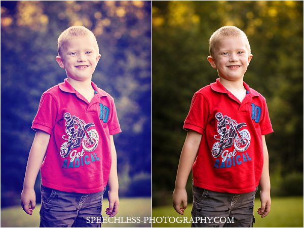
#1 – A Super Strong Vignette
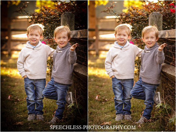
A light vignette can be a great way to draw attention to your subject, but I think we can all agree that a heavy one just draws attention to itself.
#2 – Too Smooth Skin
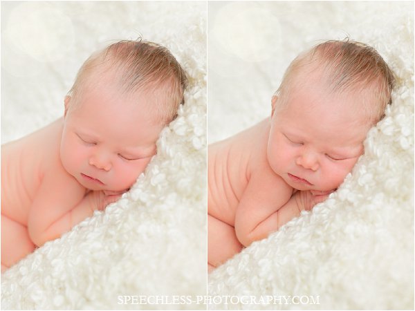
Reducing the look of skin problems, pores and wrinkles is a good idea for certain subjects, but give them texture-less “Barbie” skin and they won’t even look human in your photos.
#3 – Over Saturation
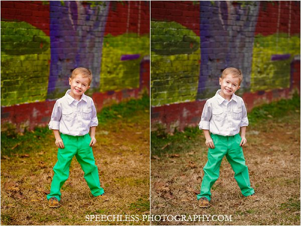
I love a slight color pop, but over saturated colors don’t print well and are sort of like the photography equivalent of typing in ALL CAPS.
#4 – Alien Eyes
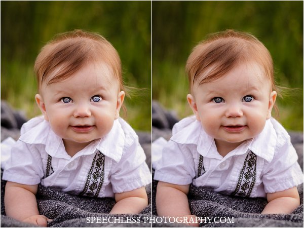
Seriously, when was the last time you saw someone walking around with alien laser-eyes in the real world? A small amount of brightening and sharpening is fine, but be careful of eyes that look fake.
#5 – Action/Preset Overload
Artistic actions and presets can be fun, but when you don’t really know what they do, you run the risk of getting crazy results. People just shouldn’t be blue, and every photo doesn’t necessarily need a yellow, vintage effect. A clean edit will never go out of style.
Now, one extra one because it is a common problem, either in camera or done with the crop in post-processing.
#6 – The Tilt
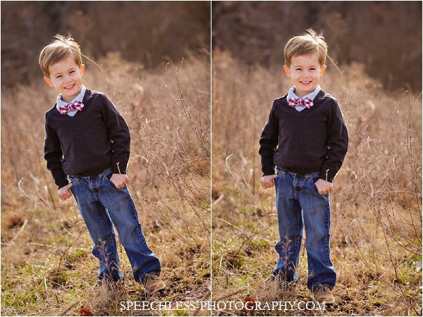
The tilt is less an editing issue and more a photography issue. I’m including it because when I was starting out, I thought that a severe tilt made my photos look so professional that I crazily tilted almost every photo.
This one is subjective since some people really like this look, but I got tired of tilting my head to look at my photos and having my subjects look like they were going to slide out of the frame. I do really hate a crooked horizon, so please, please fix those when you edit. However, if the tilt is part of your style, then really go for it. A slight tilt just looks like a mistake.
My examples above were definitely on the extreme end of the spectrum, but even if your vignettes, eye edits, saturation, etc. aren’t quite to that level, it’s possible they could still be overdone. I like to think of my straight out of the camera photos like a clean, fresh face. It’s not the finished product, but by getting the basics as close to perfect as I can in camera, I have a good foundation to start with. Then my edits are like makeup.
Done correctly, photo edits simply polish and accentuate the good that was already there. Also like makeup, if you can easily see exactly what you added, then you probably did too much.
So now you’ve seen some of the mistakes I made as I was finding my way towards my final style. Are you guilty of any of these in the past? Have you you left them behind as you gained more experience and found your own style? Or, does your style include rocking some of these techniques and you think I’m a crazy person for not liking them?


